Powered by Blogger.

Styling your walls with Desenio*


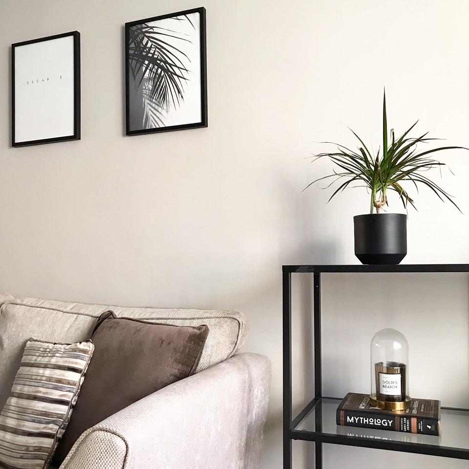
I recently wrote a post all about styling your home on a budget, and talked about a few different ways in which you can decorate and style things around your home. In this I briefly touched upon my Desenio collection, and how their posters have helped to bring my decor together, so today I’m going to talk more about the ways in which you can style them.


-


To some, wall art can be daunting; figuring out what you want, in which size, and then there’s laying it all out on the wall. It’s actually a great way to make your home (and walls) that bit more unique - there’s so many possibilities and it’s all dependant on how you want it. You can be as minimal and simplistic (like me) as you like, or you can create an epic gallery wall with colourful prints and quotes galore. Desenio have a great inspiration page for styling a gallery wall on their website which is really useful to see different layouts and sizes, as well as a create your own gallery wall tool which is pretty fun!


To make things a little different or make your prints stand out, Desenio sell picture mounts which help to frame your posters that little bit more. I love using these and have a couple of them for singular prints hung around the house. They also sell picture ledges which create a more relaxed style, this allows you to move about and swap things without the commitment of a nail in the wall. They are only available in white, black or oak but make such a nice feature on your wall. These are ideal for anyone who likes to switch things up a lot or can’t decide on where to place their frames!


If you're not sure about where to even place frames on your walls, you can always opt for the easy option of standing them against the wall. This is such a fool proof way of creating that relaxed vibe (and also great if you rent your house and can't hang things on the wall!) I love how this looks and you can place them on anything from a side table, to a fire place, and style them with all your favourite bits and bobs.


My house is now full of Desenio prints - I can't get enough of them! I now have 2 of the picture ledges too which I'm obsessed with. If this post has inspired you to make a Desenio order yourself, you can use my code CALLY10 to get 10% off. This is an affiliate code so I do make a small commission on this but I wouldn't promote something I don't genuinely love myself.


*This post was in collaboration with Desenio. Some items were gifted.


Remember you can keep up to date with my posts here:

Bloglovin | Instagram  | Twitter | Pinterest

Charlotte Tilbury lipsticks | Review & Swatches


Ahh Charlotte Tilbury lipsticks and their dreamy rose gold packaging. There's no denying that packaging sells, (I defo bought the middle one based on the packaging alone) and she definitely knows how to make beautiful products. It seems like I suddenly went from owning 0 of her lipsticks to now owning three - 2 of which are in the same shade! To me these lipsticks were always seen as luxury, (again, probably based on the packaging alone) and I only ever dreamed of owning one myself, so to now have 3 sat on my dressing table is amazing. As you can probably tell, I had high hopes for these iconic lipsticks, but were they really worth the hype - and the price tag?


-


First of all you're probably thinking, why do you have 2 lipsticks in the same shades? Well my lovely friend Gweni @ gbeauty.co.uk bought me Pillow Talk as a secret Santa present (my first ever Tilbs!), and my Mum also got me 'The Gift of Pillow Talk' set which included the lipstick as well as the matching lip pencil. So, I actually only bought one of the lipsticks myself - JK Magic.


It's worth noting that the two lipsticks here are in different formulas - Pillow Talk is one of the Matte Revolution lipsticks, and JK magic is in the K.I.S.S.I.N.G formula. If you would of asked me 4+ years ago, I would of hands down said that my favourite lip formula was matte; but now that I'm a bit older, and trends have changed, I much prefer a creamy or glossy formula now. These lipsticks however have had me second guessing myself, as I've got to say I'm more of a fan of the Matte Revolution formula.


Top shade - Pillow Talk (£25)

Pillow Talk is an iconic, best selling shade (so much so that they've now widened the range and introduced Pillow Talk Medium and Pillow Talk Deep!). The original shade is a beautiful dusky pink tone, and is super complimentary on fair to medium skin tones. The Matte Revolution formula is such a unique, soft matte formula, that it almost doesn't feel matte at all. Like I said, I used to love matte formulas until a few years ago, but this is far from what you would expect a matte lipstick to feel like. It glides on so smoothly yet still provides the staying power you need. It isn't drying at all, and leaves a kind of satin look on the lips. I was really impressed with this formula, it definitely feels luxurious!

Bottom shade - JK Magic (£28)

JK Magic is part of the Hot Lips 2 range, which is made up of 11 new shades that are all named/inspired by 11 iconic people. This one of course was inspired by JK Rowling, and I love the magical themed packaging that was paired with it. This is a really lovely peachy nude shade - somewhere between a brown and a pink; my favourite kind of shade. The K.I.S.S.I.N.G formula is rich and creamy, and just melts onto your lips, leaving a buttery finish. Again this one feels very luxurious, but is slightly more comfortable on the lips than the Matte Revolution formula. 10/10 for packaging on this one for me.


-


So are they worth the hype? To put it bluntly - yes! The formulas are both truly unique, the colours are rich and complimentary, and the packaging, well, you get what you pay for don't you. The price point is a little steep but I think it's one of those items that you have to treat yourself to! Are you a fan of Charlotte Tilbury lipsticks?

This post contains affiliate links


Remember you can keep up to date with my posts here:


Styling your home on a budget


Happy 2020 readers! This is my first home related post on my blog so this is quite a new one for me. If you follow me over on Instagram (find me here) you’ll know that I recently switched up my feed to be less beauty focused and more home & lifestyle related. I’m really loving sharing photos of my house and exploring a different style of photography than what I’m used to. Don’t get me wrong I still love my beauty posts, but I really wanted more of ‘me’ to show through, and share what my actual surroundings looked like rather than just the staged white & bright product shots.
Since introducing more interior and homeware into my feed, I feel like I’ve got a really good response from my followers. I love having a nosey at other people’s decor for ideas and inspiration and by me sharing mine that’s hopefully what I want to do for other people too.

Mirror - hm home

As with beauty, I’m all about that bargain life when it comes to styling my home. I guess they’re kind of similar in that way, that the key is in the styling, and not necessarily the product itself. You can 100% achieve that luxurious look for less with the right homeware and styling. For me I wanted to go for neutrals in my house but not the obvious greys, so I opted for taupe and mink shades instead. I feel like these colours look much more sophisticated, and by going for neutral colours it really creates a minimalistic yet contemporary look that’s easy to style. I feel like the colour scheme you go for really matters if you’re after a more expensive or luxurious look - deep navy blues and emarald greens are also really great at making a room look more sophisticated.

 Side unit - Ikea
Plant pot - hm home

 Candle - hm home
Bell jar - Ikea

The next part is all about the styling - it’s all in the details! I opted for minimalist black furniture, something with space and shelves that I could style, I also have the matching tv unit which is the same but not quite as tall. I love them as the black really stands out against the walls, and it looks a bit more contemporary than white furniture in my opinion. I have the shelves filled with bits and bobs - books, vases, plants, but mainly; candles. My favourite things! 

Wall art - Desenio

Candles are a really great way to spruce up your house and by styling them on a tray or inside a bell jar, this makes them look 10 times more presentable. I also love dotting plants and flowers around the house as they aren’t too expensive to buy, but bring a stylish edge to your decor. You may have also noticed the slight palm tree theme too - I couldn’t resist these prints for a more relaxed vibe. Gallery-style walls are a great way to add character to an empty space too!

Vase - Homesense

For larger furniture, and especially as a first time buyer or someone tight on money, you should definitely check out ebay for some bargains. I managed to bag my (Next) walnut dining table & 4 faux leather chairs for just £120 and in really good condition too. I was really lucky in finding those, they go with the decor so well, and I love styling it with a gold dish in the center filled with candles. Another option is to up-cycle your old furniture, it’s amazing how much a fresh colour can transform an old piece, or even just refreshing the handles.

Footstool - Cult Furniture

Gold tray - Ikea

Overall, the trick to creating a ‘luxurious look for less’ is to pick a scheme and to stick to it - so for me it’s minimalistic, black/dark furniture and gold details. If you stick to it without adding random bits into your decor, it’ll create a more ‘put together’ look - even if you didn’t really put much effort (or money) into it. And remember,  you don’t have to spend a fortune to make your home look beautiful!


Remember you can keep up to date with my posts here:

Bloglovin | Instagram  | Twitter | Pinterest